
Zing Rust
Primary display voice for hero and emotional section headlines.
Site-wide design standards
A working reference for visual standards, reusable components, and interaction patterns that are worth carrying into other LifeWise campaign pages.
Site-wide design standards
Use big, condensed, expressive headers for emotional moments, then keep supporting copy simple and high-contrast. For section headers, use the no-orphan-heading utility and bind final phrases with keep-together spans when needed.
Call it: Header hierarchySection title
One director away.
Compact headline
Get your church involved
The page mixes bold display type with sturdy body copy. Protect the display fonts for headers and button labels; keep paragraphs readable.
Call it: Font pairingZing Rust
Primary display voice for hero and emotional section headlines.
Bebas Kai
Navigation, buttons, category labels, and compact component titles.
Bogart
Optional editorial accent when we need a softer, more literary tone.
Lato body copy
Standard paragraph and UI body text. Use bold weights sparingly for clarity.
Core tokens used across the page. Red carries urgency, yellow carries action, blue carries media controls and supportive motion.
Call it: Color paletteLifeWise red
#DB2F3C
Dark red
#B91F2C
LifeWise yellow
#F5D536
LifeWise blue
#499ED7
Ink
#282828
Muted
#77716F
Warm white
#FDFBF9
Line
#E9E1D7
Use one consistent section edge distance so the page feels intentional. The current standard is 112px on desktop and 56px on mobile.
Call it: Section rhythmpy-28
112px desktop
Use on standalone content bands where the section border should breathe before and after the content.
py-14
56px mobile
This is the mobile spacing shown in the Russellville red CTA band and should be the default mobile section edge.
Outer edges only
When one visual section is split into multiple React components, apply the standard to the outside edges only. Do not stack row padding plus section padding at a boundary.
px-[clamp(1.5rem,8vw,8.125rem)] py-28 max-[560px]:py-14Use real program moments, students, leaders, and community context. Favor full-bleed images and strong human faces over abstract stock.
Call it: Photography carousel
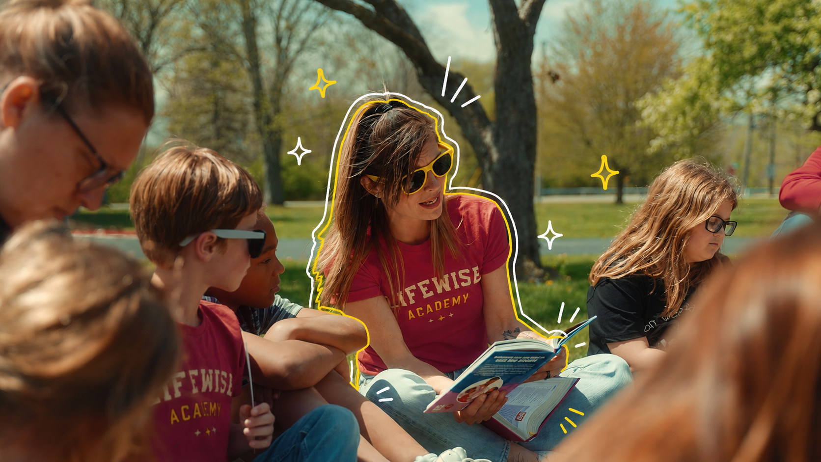


Use doodles and hand-drawn emphasis as supporting energy, not as decoration everywhere. They work best over photography or red panels.
Call it: Doodle texture panel
Doodle texture
Use simple line icons inside red circles for action lists and soft badges for cards. Icons should clarify, not compete with the type.
Call it: Red icon badge gridperson
church
gift
message
Lists
Use this for stacked rows where each item is a direct action. Descriptions are optional, so the same component can be compact on landing pages and more descriptive in guides.
Call it: ActionList + ActionListButton<ActionList>
<ActionListItem>
<ActionListButton
title="Get your church involved"
description="Receive a starter church packet"
href="/churches"
/>
</ActionListItem>
<ActionListItem>
<ActionListButton title="Give" href="/give" />
</ActionListItem>
</ActionList>Lists
Use this when each item needs supporting detail. On mobile it saves space, exposes one detail at a time, and still looks tappable.
Call it: Collapsible action listReceive a starter church packet and help churches rally around the launch.
Sponsor Russellville's first year and help the program start strong.
Tell the launch team you are interested and want to stay in the loop.
<button aria-expanded={isOpen} onClick={toggleOpen}>
  <span>{icon}</span>
  <span>Get connected</span>
  <Chevron />
</button>

<div className={isOpen ? "grid-rows-[1fr]" : "grid-rows-[0fr]"}>
  <p>Tell us you are interested.</p>
</div>
Embedded videos should sit in rounded, photo-led frames with the play control in a predictable top-right or bottom-right location.
Call it: Embedded video frame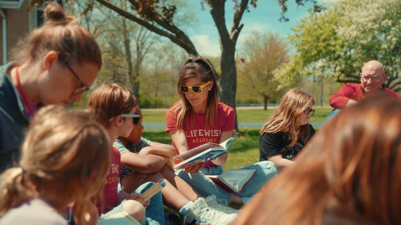
Keep the poster visible while the player loads. Avoid black bars, avoid default Vimeo end screens, and keep the primary control obvious.
Media
Use this for mobile full-bleed video moments where the media should stay in the same tall container and use our controls instead of Vimeo's native control bar.
Call it: MobileVerticalVimeoPlayerOn mobile, the vertical Vimeo crop fills the section and uses our pause and mute controls. Desktop can still use the full horizontal embed when that layout is stronger.
<section className="relative min-h-[620px] overflow-hidden bg-black">
  <MobileVerticalVimeoPlayer
    title="LifeWise vision vertical video"
    videoId="1203448400"
    videoHash="9a36f4b253"
    initialMuted
  />
</section>
Looping video tiles should feel like moving photography: cropped intentionally, muted by default, and paired with text below the image.
Call it: Looping video tile rowShort description lives below the image.
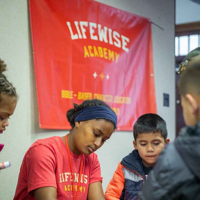
Short description lives below the image.
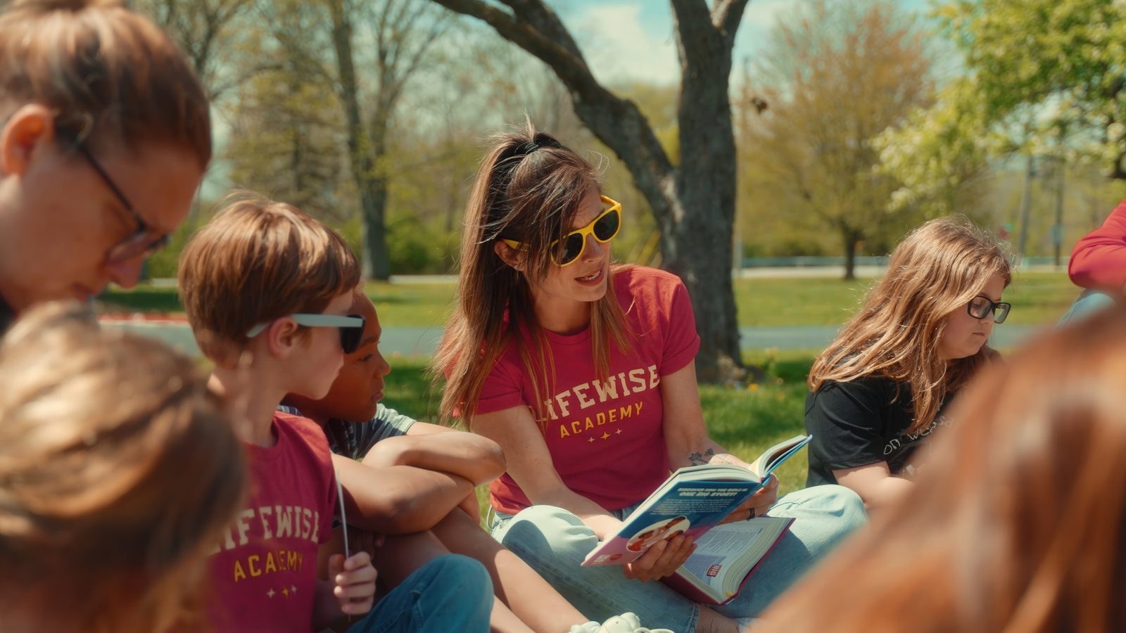
Short description lives below the image.
Media
A reusable vertical story tile pattern: media fills the card, controls sit inside the tile, and copy lives below the visual.
Call it: Photo/video story cardCopy stays below the video so the image can breathe.
<article className="w-[min(360px,31vw)]">
  <div className="relative h-[520px] overflow-hidden rounded-[28px]">
    <video className="h-full w-full object-cover" muted loop autoPlay />
    <button aria-label="Pause video">...</button>
  </div>
  <h3>Connor's Story</h3>
</article>Use short, directional headlines. Lead with the need, the opportunity, or the next action. Supporting copy should do the explaining.
Call it: Title copy setOne director away.
Clear need, campaign-ready.
Who do you know?
Referral-oriented and conversational.
The greatest opportunity to reach the next generation
Vision-first emotional statement.
Not the director? There's still a place for you.
Inclusive secondary CTA framing.
Reusable UI should feel warm and tactile, but not overly glossy. Cards, forms, modals, and accordions need visible edges and clear focus states.
Call it: Warm tactile UICards
These are best for forms, CTA panels, and compact stat areas. They keep a visible edge, tactile surface, and accessible focus states.
Call it: Soft UI cardA primary path for someone ready to explore the role.
A referral path that stays calm and clear.
A next step for people who want to learn more.
<SoftCard className="p-6">
  <SoftIconBadge>{icon}</SoftIconBadge>
  <SoftCardHeader>
    <SoftCardTitle>I might be the one</SoftCardTitle>
    <SoftCardDescription>
      A warm, tactile reusable card.
    </SoftCardDescription>
  </SoftCardHeader>
</SoftCard>

<SoftButton variant="primary">
  Copy message
</SoftButton>

<SoftButton variant="quiet">
  Start here
</SoftButton>
Sections
The hero is reusable as a photo-led conversion section: background media, centered need statement, location context, and paired CTAs.
Call it: Photo-led heroRussellville, Arkansas
School approved. Churches committed. Now Russellville needs a leader.
<section className="relative min-h-[760px] overflow-hidden">
  <Image src={asset("hero-program-director-group.png")} fill alt="" />
  <div className="relative z-10">
    <h1>One director away.</h1>
    <ButtonLink href={applyHref} size="hero">Apply now</ButtonLink>
  </div>
</section>